(P.S. below are self -reminders)
For this task there are two parts. Using tracker in aftereffects the program is able to identify a single point and follow it even if it is a shaky video. The best part id that when using these trackers it leaves a path - exactly like using position keyframes, including keyframes- and imagery and text could be attached to this (along with any animation or effects attached to those) and thus be unmoving in the video.
The process in using trackers in itself is really simple. First is right clicking the layer you wanted tracked and select 'track motion'. Open the tracker window from the window tab, select 'track motion' and a double layered square appears and if you click within the outer layer the square magnifies. You drag this square over the point wanted to be tracked. The inner square serves as the border for the area under tracking a small square = a smaller area tracked...I think XD Then you press the play button in the tracker window and it should follow the point through the video (should). This could be done in the middle of the video beginning etc. and the path of the tracker can be altered like the path of a position animation keyframe.
To attached images/text go back to the original composition window and place in file, drag the item/s focal point to where it should be in the video (a near the tracking point). Back to the tracking window, choose edit target, pick layer accept x/y (if text) and the file should follow the same path as the tracked point and remain still in the video. Many trackers can be present at one point and on the one image.
For the first part of this task there was a short shaky video of buildings and using the techniques mentioned above attach a text or image to the building and experiment with rotating the words. Despite using the tracker i find that in aftereffects the tracker tend to stray point no matter what method I use to try stop it (stabilizer, choosing colour differentiated area). In the end it was still shaky but the link between the text and a point was still slightly visible - I used a effect on the 'CI building text' it only made the whole thing due to the funny tracker, but I left it there as an example.
The second task is using motion tracking again but instead of tracking a point it was a square area that was being tracked and an image was to be placed in the screen (since the video was of a move computer). The process was the same as with the point tracker but the 'Track type' changed to parallel corner pin using the toggle button. Track a area meant that there was a change in border shape and as the area was tracked the outlines of the area tracked had to changed in the middle. Sadly for some reason I had the same shaky result as with prt one of the task
There is stabilizer which creates another point that is supposed to help keep tracker point consistent but it is fairly unhelpful during the task and can cause a bit of confusion in layers even if labeled.
Even if I failed terrible at this aspect of after effects it was fun to see how the feature worked - it reminds me of the TV advertisements where the text/words would follow behind people or swing out from buildings.
link;
http://www.vimeo.com/15055006
http://www.vimeo.com/15055550
Friday, September 17, 2010
Task 6 - Audio Keyframes
A simple task, there is an audio provided and we find an image from a previous task and converting audio into keyframes animated the character to 'bop' to the beat. By opening audio into keyframes it recreates the audio values but in key frames. These key frames can be copied into the character's position values via copy/paste but to be a different value (position etc,) you have to link it to the layer through 'expression'.
The character was then copied twice (one layer with audio key frames other not) and masked so that in the animated character only the top half can be seen and is joined to the non-animated bottom half of the other dog are together to create the 'full' dog image. When this is played the top half will move to the audio key frames while the bottom half is still creating the 'bopping' sensation. Also the audio key frames can be adjustment manually - I had intensified the reaction of the character to the audio keyframes by pullin up their values in the curve-keyframes
This concept of audio key frames is quite interesting and usefull tool, espescially in video - is this how they make those flickeringbackgrouns and edges during movies.
http://www.vimeo.com/15051066
Task 5 - Temporal Graffiti
A 4 second video (100 frames). We were given an image and, finding our own images, were meant to animate the masks so that the images fade in and using multiply layer settings to make images semitranparent and lower saturation and curves in the effects so that colour will not over power - creating a graffiti effect that will fade in and out.
Animating the masks include the feather (hardness/softness) of the mask's edge, and movementof the animation by moving the points of the mask and timing the mask path. Inverting the mask means that the selection area reversed, the add toggle means that the area selected will be shown, while subtract is were areas highlighted would be hidden. This was how the images were able to animate in using masks. A second mask layer, which was animated to uncover images, is in subtract mode, so that when the subtraction mask (which was covering the image) animated away it revealed the image underneath - feathering was added to this so that is was a smooth removal of the mask.
With mine I decided a Japanese theme and picked old japanese images, I altered the edges of the images or changed their scale so that it appeared to ofollow the wall and was sprayed on. For the castle on the floor I only coverec the middle of the picture so that the edges was still visible (creating a stencil effect), squished the image's scale so that it was inlined with the floor and made the subtractive masks appear like clouds to suite theme.
1http://www.vimeo.com/14969618
Task 4 - Kinetic Typography
For me this was a hard task, to ellict emotion I am use to using words in the video. So in this video I treated the words as if they were actual imatges and altered their size/direction to create imagery with the words themselves in the literal sense. The hardest part was trying to keep track of the camera, how it would interfere wi the light layer and if I made a image 3D..where would it appear?
For this week were taught how to create text, use camera and import audio for our videos. Importing the audio was no trouble, it acts the same as any other media file except to hear the audio the playback mode had to be used (which was slightly slower in my opinion) and that if the cache goes away or changes hell breakes lose. Creating text is again like an normal image by selection 'T' button you get into the text mode and when you type (unless you highlight an already exsisting text) creates a new layer. The best part about the text feature in aftereffects is that it can be edited in font and size anywhere, unlike photoshop, and all these features including colour can be animated. Now the camera is a tricky thinkg to use it creates a foreground and backgroun and let you zoom in past the image (not into the image itself), at an angel or turn the whole axis of the images that are set to follow the camera. Only images set to 3D layer and have will work with a camera. All features of the camera can be animated and timed.
There was also a l'ight' feature, which is similar to the camera in how it can be manipulated and moved 'in' 'out' and 'past' images, which also uses the 3D layer so if you use both in a single video, the camera will effect the light wether you want it to or not. Ligh can be adjusted/animated in the following features; intensity, shape of the light angle/position, 'zoom' ontop of the many usual tranfiguration settings. I placed my 'zoom' on high and created a flash flare by animating the path and intensity of the light.
More than one camera/light could be used at once since they are just like any other layer. Directionn such as left, rght, in, out, up, down are all representaed in 3D layers such as camera and light by different X,Y and Z values.
I myself don't like the camera besides the zomming in and out I find that all the rest of the movements can by replicated really easily using the simple features generally - it's much to confusinf not only to keep track of the camera values but changing it later on back into the defualt view.
1http://www.vimeo.com/15050995
Task 3 - Temporal and Spatial Montage
Mad Mack's advertisement - a 20 second mute advertisement for the company. Based on examples given the style for the advertisement was flashy and ..crazy (as mentioned). The animatating was quite simple - I stuck to simple transfiguration settings. This was totally redone after I did the 1st assignment, the movements were to slow and jerky to be really exciting and interesting as athis type of ad should be. I also used the wriggle effect alot for the bakground stars (it's really good at creating the exspastic look when used on top of rotation and scale animation).
Using effects are akin to using any other think aftereffects; there is a key frame layer which is used to time everything and adjustment can be made there or in the effects window to the side.
Overall nothing really stands out while doing this project (it was like doing a more elaborate version of the jump wall task). The hardest part was find images and fitting concept to the one theme.
http://www.vimeo.com/15041780
All Tasks Complete! - Task 2 Temporal and Spatial Montage
Yay! as of now I was able to finish my second assignment early in time for my trip...although there is still some I'm not happy with.
First completed was the Temporal and Spatial Montage from week three. For this task we were supplied wioth 5 images and we had to animate at least one character from each picture to jump over a wall (which were also supplied with) in aftereffects.
The first step in the process was masking all the chracters I had wanted from each image. Since this was similar to photoshop's selection tools I did not have too much trouble creating a mask using the standard pen tool. Thinking back I had favoured using the standard pen tool all throughout the masking rather than using the gradient pen to create curved outlines. While less fidgety using only the standard pen to create curvews made the mask harder to animate of edit because all the higher number of points needed to create curved lines.
After masking I then opened the wall picture in photoshop and separated the wall in the foreground of the image from the background by layer via crop. The half of the picture was then saved as separately so that the characters can later bee seen 'jumping' behind the wall rather than in front - by jumping 'behind' the wall it adds dimension to the whole video and will appear realistic.
A new project was created in after effects, composition settings etc. and all the images were imported and places into the composition. The images were then scaled down as there too large for the composition size.
The images were then ordered according to the sequence I believe I had wanted for my composition (it changed quite a lot as ideas for the final video was developed). When ordering images/vidoes whatever is ontop while be the top layer. Therefore the fore wall from the 'wall image' provided was placed at the top of the list, all the character in between and the background behind them. This resulted in the characters jumping behind the wall but before the background from the image - had to be very careful about lining up the two halves of the wall image though.
To animate in Aftereffects keyframes are used to change the values of the object and it's effects against the time. Usually movement between these 'keys' are linear - since the animation could be represented as curves - and the shift from one key to another animation segment is constant. However there are other key types such as Hold - where the animation is held at the point until it snaps into the next section, Ease in - where just before the next key frame the animation slightly slows down, leading to a smooth transition into the current frame, Ease out - a smooth exit from the frame, slower beginning into the next keyframe, and the combination of both ease ins. Although it's easier and generally more natural to use the ease in key I found myself more comfortable using numerous keys to achieve the same affect so that the timing can be edited and perfected exactly later.
When picking my characters I decided for the most abstract poses so that I could have a bit of fun trying to to get them to interact with each other in the video.The first character I had animated was a female wearing exercise gear and also in starjump pose. I used the position keyframes to make her jump in growing jumps to the other side of the compositions in simulation of a daily exercise. Then just for the fun of it I picked I 'skater' dude and had him leap over the girl as she reached the end, using a bit of rotation animation. Then there was a guy who was seemingly sliding, so I did exactly that. I had the character skim through the air by lengthening the distance between where he left the ground and his landing. This also meant I had to change the path and 'strength' of the man's jump in comparison to the other character's that it would seem natural when he 'skid'. Later on, after the due date of the 1st assignment, I went back and made one of the men jump the dog character..just a crazy idea that pooped up while watching the telly. So that the man's leg could be over the side of the dog for the ride I created another mask to cover the dog's hide in the shape of the leg - this had to be timed as the dog would have had a hole in it's side when I first jumped over the wall.
Motion blur - an effect that picks up on fast movement and creates a speed blur - was used so that all character's jumps would have that realistic touch.
When creating this video the hardest part was not the actual animation but preparing the images and creating a concept before beginning - the animation only takes a long time to complete but it's not that difficult at this point.
link to task 2 - http://www.vimeo.com/14921858
-we were also taught how to create solid shapes in the Tutorial which can act both as backgrounds are as characters in themselves
Saturday, August 28, 2010
Assignment: Complete!!!
I'm soo releaved! I spent so much time on AE and I could only have time after 5 to work on it plus my AHS work and GRAHH!! so much is due this week! - lol to get it done I even had to miss 3 days of school this week...if only cs4 was easeir to find! - I just found the program this Monday, because Mum doesn't trust internet buying...gotta agree with her; what would happen if the internet stopped in the middle of the download 0.0.
Anyway, onto my progress. Sadly enough I haven't finished any other task since not having the program at home had made it really difficult to complete the task within the week). I'm already halfway through most of them, so I should get the other four tasks for QUT completed sooon though, as with the assignment done all I have to focus is on now is my upcomming exam block, my english and art assignment, the QCS exams on Tuesday and Wednesday...kill me TwT
With the assignment, since I've had a taste of what After Effects can do - which is possible everthing at this rate - I decided rather about the how I should concetrate on the what (composition first). I originally had three topics in mind to promote: Japan (as I just went there recently and I hance heaps of imagery), Art in general (a favourite subject of mine that I'm pretty familiar with and have access to lots of imagery on the net) and lastly; copic markers (a japanese alcohol marker brand that i'm Really find of, and I have all the products of XD, plus there are heaps of images on flickr).
In the end Idecided for copics since it's not a general as 'Art' and I'm more familiar of the 'feel' of the object in comprison to japan, also it's harder fo me to create a trourism advertisement, making Copic the easiest to pomote.
Next I needed to find an 'arty/copicy' music - not a requirement but I know that music is important in setting the feel and creating appeal for a item that your promoting (yr 10 marketing). In the end I choose a more country/barnyard song, a slow one, becuse I feel that it expressions of 'art/copic' very well "Wired but Disconnected" by duckett. Of course this meant my final product can't neccessarily be one of those retro, abstract compositon - in my opinion anyway. Although the music lyrics itself has nothing to do with copic or art I love how it says; "a thousand tunes ringing in my ears no time for conversation" soo much like me and other firends I have when we're drawing; 'Don't talk to me!!" XD
Now that my music, style nad theme was picked I had to think about the actual composition and how it will tie to both the music and promote the item. I then had a quick search (in my memory ;D, so that I won't copy it) for what other art product advertisments would look like. I had thought to do a really rough, comopisiont but in the end I come up with promoting Copics by saying "see what the end result could be if you use me" kinda thing. For this I obviously need the imagery of artists that use copics first.
Finding imagery, of actual artworks was a real task for me as, as any artist would be, very anal about people using and/or editing their imagery. In the end I opted to draw my own images (from scratch since my own drawings tend to be a manga style and thus not really workng for the advertisment I had im mind).
That done I also had to work out how to fit it what I had in mind to the music. For this music, the highlight or standing out pieces are in the beginning and end, so to make things easy I choose to use the beggining piece Xp. So looking at the beggning 30 secs I took note of all the high and lows and 'drags' in the music and came up times I needed to either make a 'escalated' prt in the video and how many "connecting" scenes I have between and also whjat should be the tone of the opening and ending of the advertisement - a vague idea of how the advertisement would turn out came form there.
After, it was all technical work which, while it takes alot of time with the fine tuning and getting the exact timing correct, was the simpleset part to execute. All the skills I needed to take my idea from my head and onto the computer was all there from tutorials, or if I needed extra help google is GOD! Ontop of the images I drew I took photos of my copics, drew my own edited vesion of the logo, and generated basic shapes such as circles, squiggles to at final touches - for this photoshop, which I got with AE, is my Goddess! As I went along I noticed that the more I used After Effects the better and more efficient I became at knowing how to use the programs, brainstormiing ideas to achieve my desired result.
The only great mile stone here point was the darn memory cach for the music! When I opened the file once it couldn't or woudn't recognise the .cfa file for the music despite me Directing it Sooo many times!! and then it wouldn't let me reload the darn music without it being mute!! in the end I was able to resolve this be renaming the music file and moving it to another locating before reloading it. This ment I needed to redited the timing for the music (since I didn't actually start at least 4 seconds into the musc and have a bit of a slight pause at the end of the composition). This happened in three ocassions!! once right when I was in the middle of watch the playback too! Another small hichup I had was theRAM playback for some reason on Wednesday morning it decided to become small - it would only play back 15secs at a time. Luckly for me by then I aldreay had a vague idea what the final piece woul look like and ha all the main imagery in place and timed. Then starngly enough, just 4 hrs before I completed the video the RAM went up again so that I could watch the whole vide in one go...Huh, weird no? Lucky for me I guess...
I used Everything we have covered in the tutorial basically, Masks and animating them especially! Panning the 'camera', photoshop, animating images, ease in/holing on key frames, timing. Also bits from lectuers like small movement details such as the hand-finger movement (not a stiff movement as shown in examples we're given) and advertising the 'identity' not the actual object.
Really at the end I only have 3/4 regrets about the final outcome:
- maybe I should of planted in more word effects? - perhaps a slogan?
- the last image of the fan when fading out should have compressed itself -but I didn't know how to do that y
- maybe the colour wheel near the end needed of cleaning near the edges?
- the whole composition...was it too repetitive? too plain? too traditional and not adstract/funky enough?
When search through the other students assignments I kinda feel conflicted over my choice in composition rather then my actual application of effects. It's really interesting to see all the different styles and types of advertisments the other students have come up with - lol the advertiment for the rock and lama paradise had my cracking up XD. In my opinion the most effective advertisements was the snow boarding one, creative spice industries and the beach (surfborad brands?), They really keep within the 'personality' of the object they're promoting. like the surfboeard add, for instance, effects and imagery, composition are all very similar to parishar adds seen on tv.
Anyway despite my doubts I'm still really proud of mysefl! I was able to complete the whole video with 5 days, minus all my AHS commitments!~ XD
The video link for the final result is here:
http://www.vimeo.com/user4449078/videos
its annoying how the video when completed is actually larger in size than when I was composing it... it makes of world of difference when the compostions is smaller (A better too).
What I shoul have done was create black border ends, either on top and underneath the promotion or at the sides. This would have a visual balance with all the white in the video, still stay within personality of promotion, visually more interesting - plus how It's how it looked when in aftereffects beacuese of the black background in the program.
Wednesday, August 11, 2010
The First Task
Spatial Montage
(from week 2 and long over due)
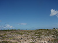 Since I was absent during the Tut for me it was all about recalling my limited current knowledge and experimenting a bit. First what I did was Get the 'Plain' image (seen right) and added another 5 layers to the images, where I would place the builings later on after I cropped them.


(from week 2 and long over due)
The First Task was, using the 6 images provided by the Uni, to photoshop 5 buildings into a dessert(?) plain. I completed finally it yesterday in between my two exams (and for info I did bad at the one I thought would be easy and did fine in the one I'd die in XD).
 Since I was absent during the Tut for me it was all about recalling my limited current knowledge and experimenting a bit. First what I did was Get the 'Plain' image (seen right) and added another 5 layers to the images, where I would place the builings later on after I cropped them.
Since all the images are of very different designs and style I thought rather than make the buildings try to match each other - a dying cause - it would be better to have a mis-matched, abstract composition.
The first image - or 'Building 1' as I've dubbed it - I choose to open in photoshop has strange, abstract, circular buildings (seen left) and will be a nice warm up, since the building's outlines are fairly simple. As most of the buildings in the images provided are 'dominant' I thought it wise to snag the smaller builing here - not to mention easier XD - to later obtain 'visual balance'. I use the Magnitised Lasso (pardon my spelling if it's wrong) to trace along the outline. The MagLaso is a lot easier to use than other types of the Lasso.
Going off topic, Lassos are used to 'select,' 'highlight' or whatever you call it objects. Photoshop has three types; the normal one - where you choose the border of the selected area by hand, the Poly(?) where the 'selection' of border is always in stright lines and the best (in my opinion) is the Magnitised Lasso tool which somehow is able to trace the outline of an ogject when led around by the mouse.
Anyway back to the Task. After I successfully traced a 'selection' that was roughly the outline of the desired building I left cleick on the slected area and clicked 'layer via cut' which transfered all of the selected area (the building) onto a different layer. I renamed the layer 'building 1' and the 'saved as' the thing in photoshop under the name of 'Building 1' for safe keeping. I then made the original image's layer - already labeled as 'Background' - not visible so that only the builing on the 'Builing 1' layer could be seen. Before the building is passable to be transfered onto the 'Plain' image the edges needed to be cleaned of any background along the edges of the building (such as small bits of sky and grass still slightly visible) as they would be seen when I place the 'building 1' in. So I zoomed in close to the image - using the side scroll - and erased all the little edges visible using different sizes of eraser to not disturb the building when cediting small ares such as between small balconies.
The 'Eraser' tool on photoshop is different to the paint version as in paint the whole area under the 'rubber' is delected and made 'blank', however on photoshop there is an option where the edges of the eraser have lower opacity (are faded) meaning that when editing I didn't have to be anal about erasing each square and worrieng about killing the builing's outline and making ook unnatural. Done editing I then saved the psd. selected the builing using the 'spuare select' tool, which awesomely automaticaly picks out the building's (since it's the only object on the selected layer) when you change to the normal pointer and copy pasted the builing into the one of the layers in 'Plain' - renaming the layer 'Builing 1. And there's the 1st building! phew that was long!

Onto the second! Stay away from the 'weirdy' buildings the second image (right->) is of a city (Brisbane city if I know my city - which i doubt -_-;). All of the buildings are terribly dull, as expected from a city, so to keep with the 'abstract' idea and a bit of fun I choose the small 'book' building to the left for my composition. I followedthe same procedure as last time; re-saved it as 'Buildng 2', selected the building outline using MagLasso, made selected builing a new layer 'via cut', trimmed the edges and pasted onto the 'Plain' on a clear layer which I renamed 'Building 2'. I found using the MagLso harder this time than the last image, primarily down the bottom edge of the structure where the edges of the building was less defined in colour - I had to make more 'points' by clicked and restert the lasso over and over to get it resonable (or maybe I waqs just being really picky).

'Building 3' was tken from the image seen left. suprisingly (or not) it was the hardest builind to crop and make fit into the final composition later on when I was fiddling with the all buildings together. I had to use the large building in the centre, cause wll there wasn't much else to choose from unless I wanted a motif that was from the side - which I don't. Same steps again above ( I doubt you want me to repeat THAT again XD) except with 'Building 3'.
Cause of the similar coloured buildings around the one I want I had to use the normal lasso by hand and try to get the out line closer as possible to the building's outline without ruining it, leading to alot more editing - this turned out suprisingly faster XD. Also I croped the bottom 3(?) storeys pf the building so that I could hide the evdence of street lights that would out of place in the desert - this was tricky as the angle at the base of the building would be ackward, but I have a soloutions so never fear!

Seen right is the 4th image where I had little choice again to choose a building - I would have neede to find ways to hide/cover areas from the background builds. Out of all the buildings this in my opnion is the most abstratc in design.
I used the normal crop tool again because it's both faster and impossible to get proper definition - by my reckons - here with the magnistise tool. When clening up the edges I couldn't get rid of the streetlamp at the base so I had to cover it later on. The slight reflection on the building made it harder to define the edges of the building and I had to constantly check if I hada acidently croped the edge of the building off. For a more realistic effect when I past this in the final composition I erased the areas behind the supporting pillars of the building.

Building 5...well obviously the Empire State building...right?...then again looks a lot like a building from brisbane...oh well! I wanted the tall middle building as the style of it doesn't match any of theother buildings - which would promote the 'abstract feel'. All the bases of the main buildings here are covere by smaller contructions so if I decide to crop out all the things covering th bases of the building it will look staunted - and I'm hesitant to stretching it cause ... well it might look a but well strecthed XD. This ment I had to crop all the buildings around the base, and I did, to make the proportion look natural and all the little buildingshave the potentional to act as visual balancers.Used normal Lasso select.
All the buildings on the same file I arranged and fiddled with them - resizing tehm to fir the canvas and arranging them to my liking (like covering the lampost visible in the 4th builidng). The sole reason I made different layers for each building was so that I could edit and play with each one to my liking as mauch as I like without having to worry about effecting the surrounding background or the image being basically uneditable (if that's a word) after I've deselected it. The order of the layers had to change so that I could place some of th buildings to the fore-ground.

The final result is this (above). After arranging them in the positions I zoomed up again and went back to clean any rough edges still visible. The building where I croped the base and left a stange angle was placed so that it stood on a hill behind the other builldings. Also I inversed the direction of the 4th building so that it is both balanced and that the street lamp is covered and I had to crop the edge of one pillar which was poking out on the other side of th building in front, looking unatural. The book building was slightly rotated to be aligned with the ground. I have also placed the circular building so that the connecting bridge (which I've kept croped in for this purpose) look like the 2 buildings are connected. Later after happy with my tinkering I added shadows to the image by adding another layer and using block colour on opacity 33% with the paint bursh tool - took special of the shadows under the 'hill' I formed under one of the buildings so that they were placed right.

This work is licensed under a Creative Commons Attribution-NonCommercial-ShareAlike 2.0 Generic License.
This work is licensed under a Creative Commons Attribution-NonCommercial-ShareAlike 2.0 Generic License.
Images are thanks to :
•Andrew Mace - http://www.flickr.com/photos/acmace/4120587279/sizes/o/
• RaeA - http://www.flickr.com/photos/raeallen/68856492/sizes/l/
• Bobcatnorth - http://www.flickr.com/photos/bobcatnorth/383409166/sizes/l/
• Sparktography - http://www.flickr.com/photos/sparktography/91830784/sizes/o/
• harry_nl - http://www.flickr.com/photos/harry_nl/4031055107/sizes/o/
• ScubaBear68 - http://www.flickr.com/photos/22310955@N02/2551583663/sizes/l/
Sunday, August 8, 2010
In the Beginning
Hi! I'm currently a student taking the subject KIB 105 -Animation and Motion graphics- at QUT (Queensland University of Technology)
From now on I'll be using Blog as a record of all my Tutorials and I'll post up here all my completed homework..once I figure out how to do that =_=; (be warned I tend to Blab a lot online and am irregular in updating, with bad typos - Horror! 0.0)
Currently it is the beginning of week 4 (and third Tutorial) meaning I have a lot to fill in to be up to date. As it is I have yet to finish any of the activities assigned by the course, for VERY good reasons I might add;
1. I don't have any of the adobe programs used by the University at home, and me being stubborn wants to use the same program as the uni so that all details and intructions can be followed/completed accurately. Also using trials of the programs I need are out until the end of September since the course will outlast the trials TwT. Luckly I can do the first task at AHS, since it's only photoshop, the second task I will try to complete this Firday, since it is a school holiday, on After Effects.
2. I was away for a week after the first week of the course - in Japan actually (you know...fullfilling my young life's dream) - where I missed the second Lecture and 1st Tutorial.
3. During the second Tutorial, I got lost in the Campus and even went to the wrong Tutorial for 20mins before realising that I was in KCB105 (embarassing!!). Then when I finally got to my Tutorial the only computer left was Busted (whimper) so I could only look on with someone - seriously was not my day!
4. I have very limited time in which I can visit the University -since I don't have the programs- to complete the Tasks set out.
Weekends are out since there are no buses to the Campus on Sunday or Saturday from the city (having no car Sucks).
Weekdays are generaly packed to the rafters with busyness and 'work' (<-- This reason's a biggy)
KIB105 is a course focusing on the design and motion of graphics (self explainatory) and uses technology. The course doesn't really cover the '2-D cartoon' animation much from what I have gathered - like I originally thought. I decided to participate with this course because of my interest in Manga/Anime/Japanese Animations, and even though the course doesn't cover what I had expected it is still an intersting subject to learn and study.
The only problem is...well... I'm technologically disadvantaged.
Not that I don't know how to turn on (most) computers - Macs just confuzzle me - but I don't have musch knowledge about programs except for a tiny bit about photoshop. The fact that I failed one (only one) semester of yr 8 ICT is not encouraging, since I haven't tinkered with computers since then.
The programs used - as hinted earlier - are Adobe Photoshop and After Effects (not exactly sure which versions actually)
Photoshop - a program used to edit images ( and if you don't know that, then your quiet sad really - I know of it, and that's saying something). While able to do the basics of paint such as copy, paste, draw, fill etc.,
Photoshops most stand out feature is the 'layers' which, exactly as named, is basically clear planes of 'technological canvases' layered ontop of each other. The cool thing is that you can make each layer visible or not and all the paint stuff - editing, pasting, cuting, drawing, filling - when done on a layer doesn't effect the other layers (unless you want it to). Also there are other fun tools such as the stamp button, effect options, and interesting 'pen' shapes 8D.
After Effects - sadly not a program I'm not really familiar with. From Tutorials I've figured you can use it to place deffects used in motion videos. It can be used to make still objects move in different ways (jump, wriggle, rotate etc.). Like Photoshop there are 'layers' of sorts so that many videos motions can be pieced together in one video. An essential part of the whole program is in the 'timing box', where all the effects are keyed into.
There will be three Assessments:
1. August 27th, Friday (30%) 30 sec promotional animated video using still images - focuses on the emotion elicted from the video matching the 'style' promoted item
2. September 24th, Friday (30%) Journal Progress os all Tutorial work (oops -_-")
3. October 22nd, Friday (50%) 1-2 min animated video focusing on the monologuue (speech) audio of the video - expands on more than one principle of aniamtion from lectures
(....is there an extra 10% there?...)
Well..Wish me luck!! XD
Subscribe to:
Comments (Atom)